
First of all I wanted to ask you all if you like my pictures bigger or smaller? I am undecided, but I'm not the one who has to come and visit and try to see my creations. I want to make it easier to see all the details, but I know the pics cut into my sidebars. So let me know what you think as my blog is for you.
Today I have 2 more layouts to share with you using the same picture of my daughter Destiny, but 2 totally different effects in the printing and layouts. I used some Glitz design paper called "Scarlett". The big chipboard frame is by Colorbok . I added some black and silver chipboard flourishes, black leather Thickers and green glitter Thickers. I love this paper and as most of you know my favorite color is green, all shades.


Here is the same pic which I printed first on my ink was running out. but I love the effect on the pic and thought it looked great on this Bo Bunny paper.
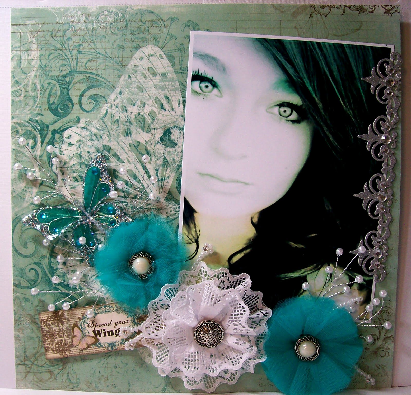
I added some more Tulle flowers and one lace flower that I made and added vintage buttons too.

I added some Flower wedding bead pieces and the Big beautiful butterfly I purchased at Michael's Craft store and is from Michael's own collections of Scrapbooking crafts called Recollections. I LOVE THOSE BUTTERFLIES. Gorgeous huh? Oh and the last thing I added is the silver glitter border strip on the side of her picture, which is also from Recollections at Michael's. The Bo Bunny paper is so beautiful I didn't want to cover up that HUGE butterfly on the side.

Hope everyone had a great Father's Day and a great start to their week. Thanks so much for stopping by, your comments mean so much to me and are greatly appreciated.
12 comments:
First, these are stunningly beautiful pages (and so is your daughter!) I like the smaller pictures because I can still click on them to make them as large as the larger one! :-)Traci
Oh wow - I don't think I could choose a favorite from those to. They're both so different, yet so stunning and beautiful. And those flowers of yours are just absolutely beautiful.
WOW!! Gorgeous layouts, and you know, I love the one with the ink running low, looks very effecrtive and gives those beautiful eyes a sort of deep intensity, but both are gorgeous.
I like the size large, cause you can click to make larger, and I only say this, as the words get cut off in the beginning with the x-large, and I like to read everything.Would'nt want to miss anythinmg. I'm too nosey..lol..
Luv CHRISSYxx
they both look stunning angela.
what great colors you have chosen.
those eyes are beautiful.
greetings karin
Wow! You told me I was made beautiful pages, but I have to admit that you excel too! I love the two pages ... the two different colors give a different look. I love them. I can't even say which I prefer ... I like the green because it's vibrant and warm. The second is softer ... Beautiful!
Hugs
Genevieve
I love them both but.. I love the teal more and the only reason being the effect that the photo took on due to low ink. What a cool effect! I was peeking at your other layouts and they are all fabulous!
Hugs Bonnie
Both are stunning but I love the one on the Bo Bunny Paper and the ink running out is just an awesome look. LOVE it.
I very rarely do any scrapbooking and these pages are why!! I just could never achieve anything so beautiful, they are both magnificent, I like the bigger ones that show the detail, wow, that butterfly is just soooo lovely
Love Jenni xx
Oh Angela. Your Destiny is just so beautiful and I agree about her eyes. They are very very beautiful as well. I could not tell you in anyway which layout I like better. They are both awesome in their own way. I love, love the blueish one with the butterfly and the flowers(awesome job) along with the boarder strip. I so wish I lived near a Michael's. lol... I have to confess I didn't even see the word eyes on the green and black layout until I went back for the third time to look at all the details. You just know that is what that layout is all about. Awesome work my very artistic friend. I love it! Hugs, Lisa
Beautiful! ;-)
Hugs
Both are just stunning. Love all the papers, colours and details and your daughter is lovely.
Hugs, Mette
I love the both, OMG such wonderful works !
xxx
Post a Comment